Key Takeaways
- Breslow installs the Azenco R-Blade™, available in 200+ RAL colors — color is a first-order design decision, not an afterthought.
- RAL is a standardized numeric color system that delivers a precise, repeatable architectural match instead of a guess from a paint chip.
- Dark finishes — black, anthracite, bronze — read as the contemporary default; light and neutral tones remain the classic choice for traditional homes.
- Always view powder-coat samples outdoors in your own light before committing — screen and showroom colors shift under real sun and shade.
Two identical structures, same footprint, same louver system, same site — and yet in one color they read as though the house was always meant to have them, and in another they look like hardware set down in the yard. Color is the decision most homeowners underestimate when planning a custom structure, and it's often the single variable that decides whether the finished project reads as bespoke architecture or an add-on.
Color Decides How Custom It Looks
Every R-Blade™ project Breslow builds starts from the same engineered core, but the finish is what makes it belong to a specific home. Because the aluminum extrusion is powder-coated rather than painted, the color decision happens early, during design, not as a last-minute punch-list item. Breslow installs the Azenco R-Blade™ in a palette that runs to more than 200 RAL colors — which means the finish rarely has to be the compromise. The question is less "what's available" and more "what belongs on this house."
The RAL System, Explained
RAL is a standardized, numeric color-matching system used widely across architectural and industrial finishes in Europe and increasingly in North America. Rather than describing a color as "charcoal" or "espresso" and hoping two suppliers interpret it the same way, RAL assigns each shade a specific number, so a powder-coat finish can be specified and reproduced precisely, batch to batch and project to project. That precision matters more than it sounds: a pergola's posts, beams, and louvers are extruded and coated as separate components, and a repeatable color standard is what keeps them all reading as one seamless finish once assembled.
The powder-coat process itself is part of why the color choice holds up. Pigment is electrostatically bonded to the aluminum substrate and cured, which resists chipping, fading, and chalking far longer than a painted surface exposed to Northeast sun, salt air, and freeze-thaw cycles.
Matching Your Home's Existing Palette
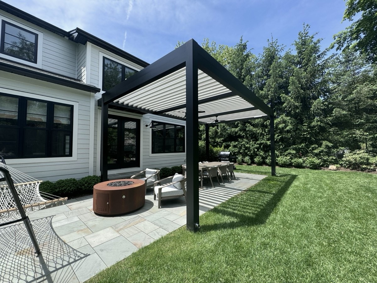
The most reliable starting point is your house, not a trend board. Window frames, roofline material, existing trim, stone or masonry accents — these are the colors a new structure has to sit next to for years, and reading them accurately is the first job of a good design consultation. From there, the decision is really between two strategies: match the structure to an existing color (window black, trim white, a bronze already used on railings or fixtures) so it disappears into the architecture, or choose a deliberate contrast that treats the structure as its own statement against the house. Breslow's custom styles gallery shows both approaches across real, built projects rather than renderings, which is a useful place to see how a given color actually behaves against brick, siding, or stone before committing.
Dark Structures: The Modern Favorite
Black, anthracite, and dark bronze have become the default choice for contemporary and transitional homes, and the reason is mostly optical. A dark structure recedes visually against landscaping and sky, throwing the emphasis onto the space underneath it rather than the frame itself, while reading as a crisp, architectural line against light-colored siding or stone. Matte and satin finishes tend to suit modern homes better than high gloss, which can read more industrial than architectural in daylight.
The honest trade-off worth naming: darker finishes absorb more surface heat in direct sun than light colors do, which is simple physics rather than a defect. It's a real factor in the finish conversation, but it's not a reason to avoid dark colors outright — it's one input among several that a designer should walk through with you rather than leave you to discover later.
| Consideration | Dark Finishes (Black, Anthracite, Bronze) | Light & Neutral Finishes (White, Ivory, Warm Grey) |
|---|---|---|
| Visual effect | Recedes against greenery and sky; reads as a crisp architectural line | Reads lighter and more open; softens against stone or brick |
| Best paired with | Modern and transitional homes; dark window frames or trim | Traditional and colonial homes; light siding or masonry |
| Surface heat in direct sun | Absorbs more surface heat than light colors | Stays cooler to the touch in direct sun |
| Design longevity | Contemporary default; less trend-sensitive than it might seem | Timeless, rarely dates a home's exterior |
Light and Neutral: The Classic Play
White, ivory, and warm grey remain the right call for traditional and colonial architecture, where a lighter structure keeps the visual weight down and lets existing millwork, columns, or masonry stay the focal point. Neutral finishes also age well in a way trend colors don't; a well-chosen white or warm grey from a decade ago still looks intentional today, where a color chosen purely for the moment can start to feel dated. That's worth factoring in for a structure built to last for decades, not seasons. The portfolio includes examples of both approaches built on real homes, not renderings.
Samples in Real Light
The single most useful step in the color decision has nothing to do with the palette itself: look at real powder-coat samples outdoors, at your own house, at more than one time of day. A swatch under showroom fluorescents or a color rendered on a screen will shift once it's sitting in morning shade versus afternoon direct sun, and the only way to know how a finish will actually read on your home is to see it there. Bring this into the conversation early.
Ask your contractor: "Can I see this exact RAL sample outdoors, next to my own trim and windows, before I sign off?" If the answer is a screen photo or a showroom chip under indoor lighting, push for the real thing.
Breslow starts every project with a free design consultation on Zoom, where finish options, architectural style, and a realistic investment range all get discussed up front, before a single sample ever needs to leave the truck.
Frequently Asked Questions
How many colors can I choose from for my pergola?
Breslow installs the Azenco R-Blade, whose aluminum systems are available in more than 200 RAL colors, so matching an existing trim, roofline, or architectural palette is almost always possible.
What is the RAL color system?
RAL is a standardized numeric color-matching system used widely in architectural and industrial finishes. Each RAL number corresponds to a precise, repeatable shade, which makes it far easier to specify an exact color for a powder-coated aluminum structure than working from a generic paint chip.
Do dark-colored pergolas get hotter in the sun?
Darker finishes do absorb more surface heat than light colors, which is simple physics, but the aluminum structure and powder-coat process are engineered to handle that exposure. The color decision should be driven by the look you want and your home's architecture, and a designer can walk through the trade-offs during your consultation.
Should my pergola match or contrast with my house?
Both approaches work, and the right one depends on your home's existing palette. Matching trim or window colors creates a seamless, built-in look, while a contrasting tone, often a dark finish against light siding, treats the structure as its own architectural statement.