


✦ Established 1924 · Four Generations
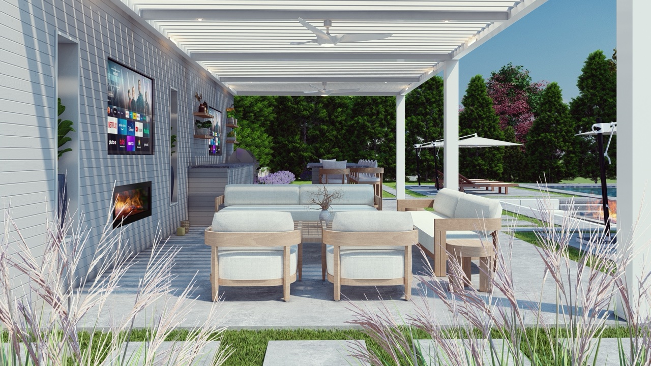
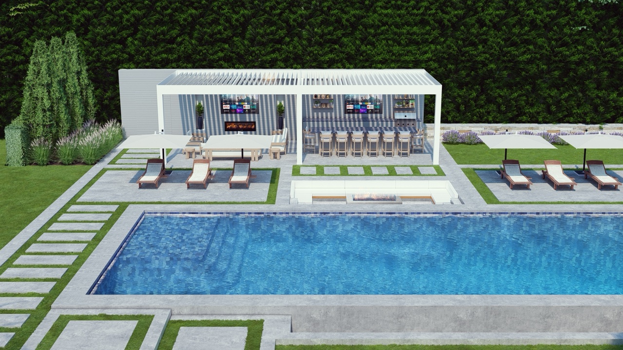
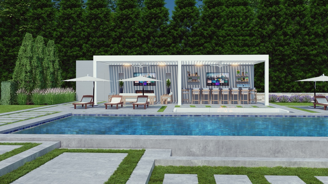
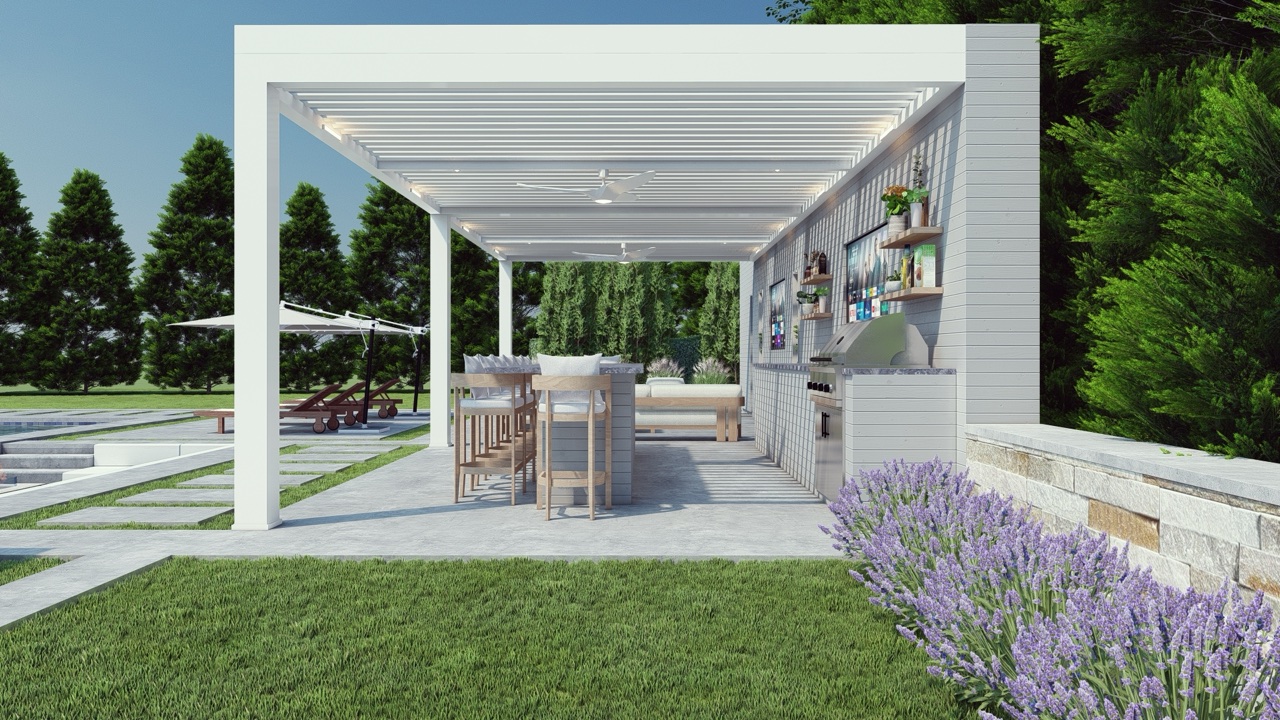
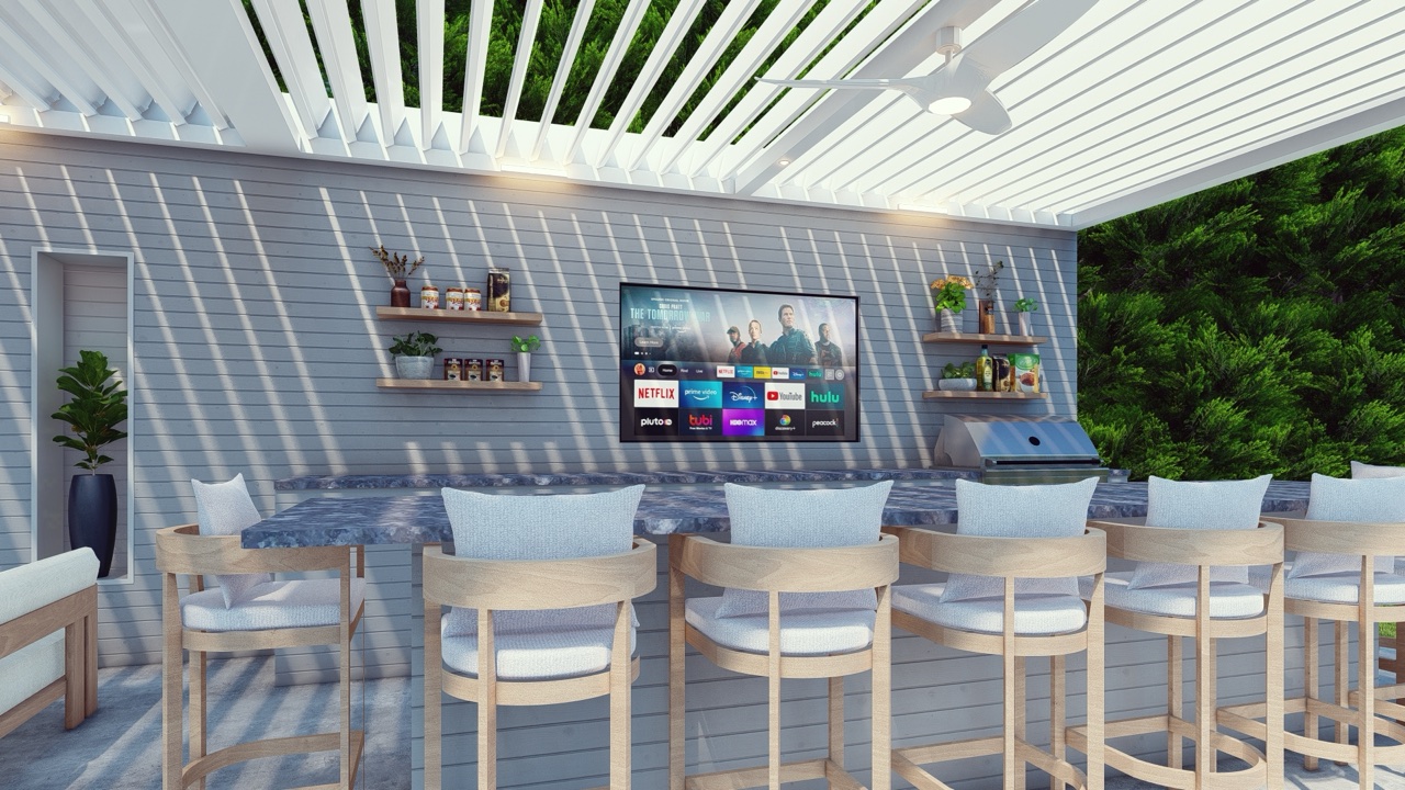
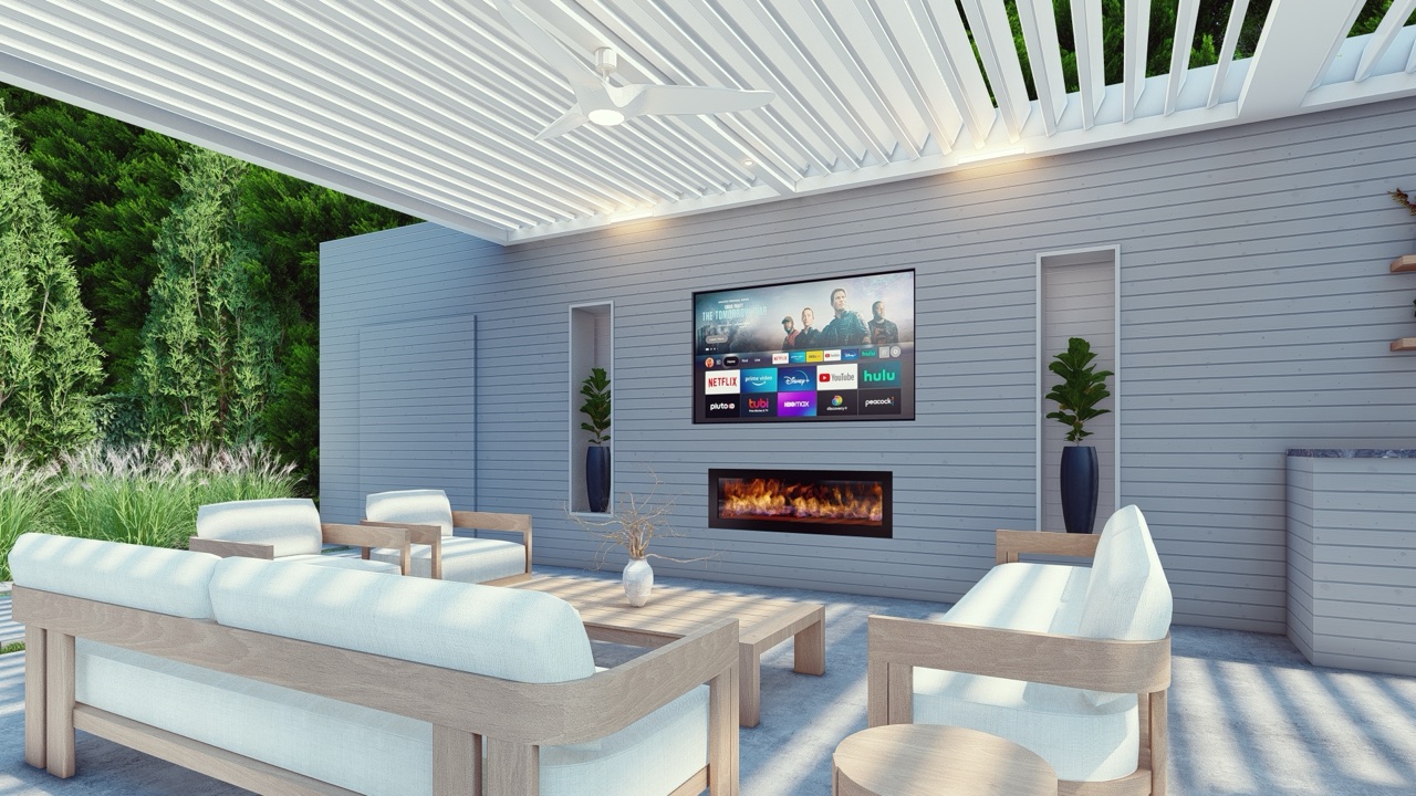
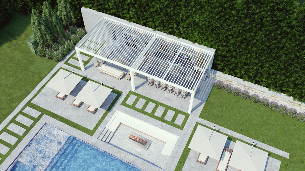
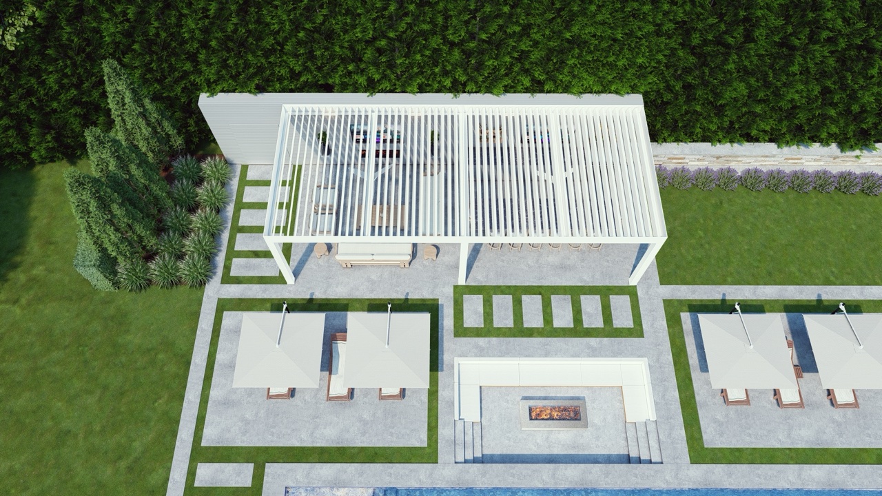
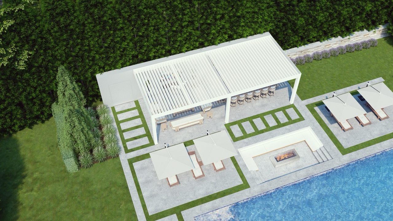
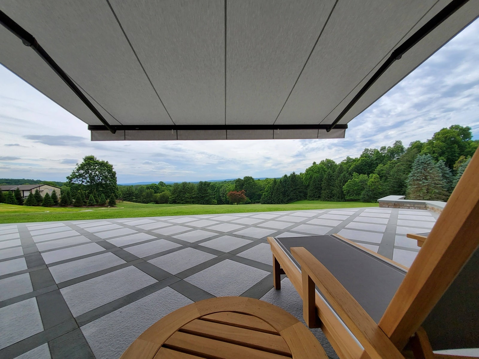
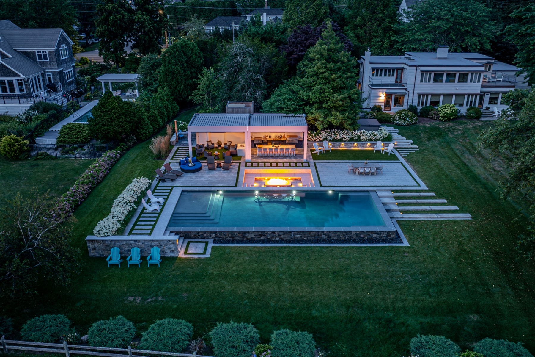
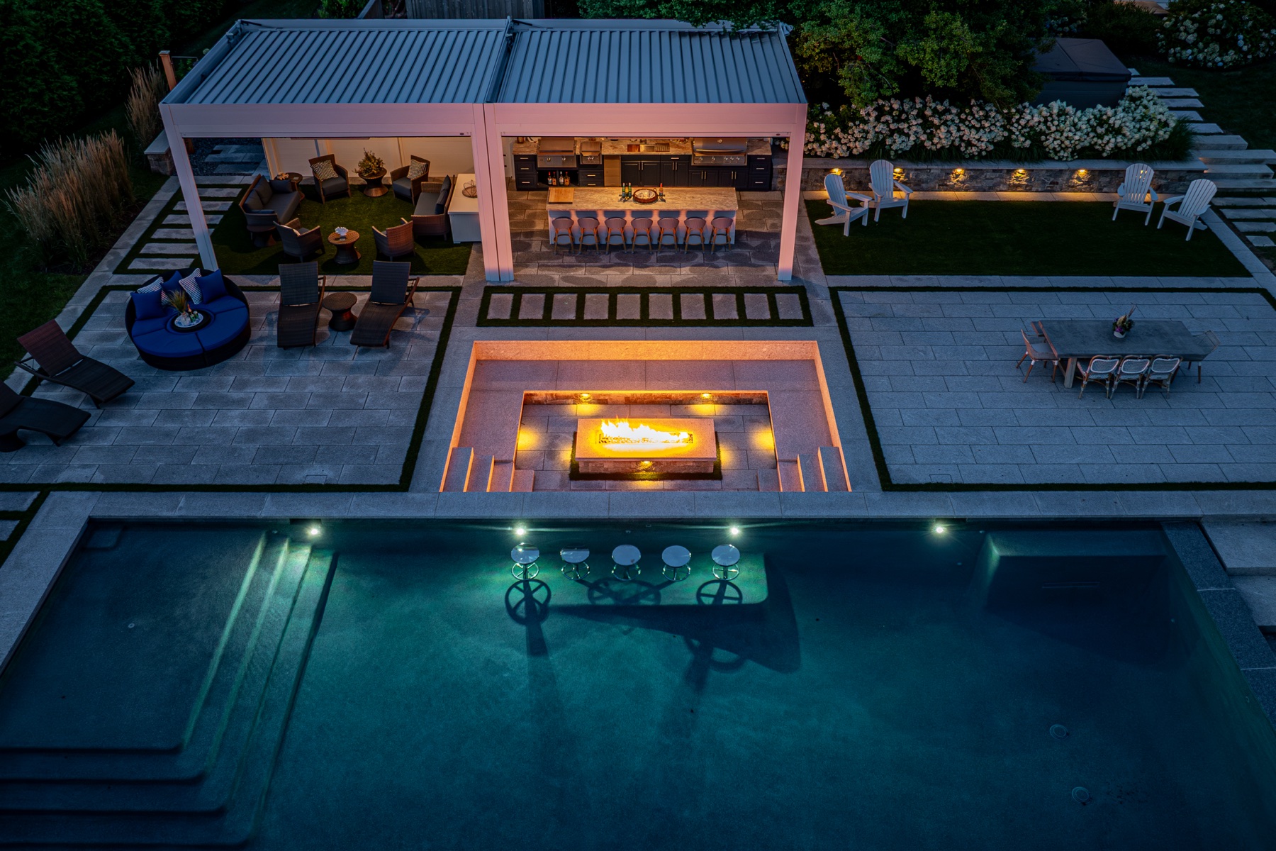
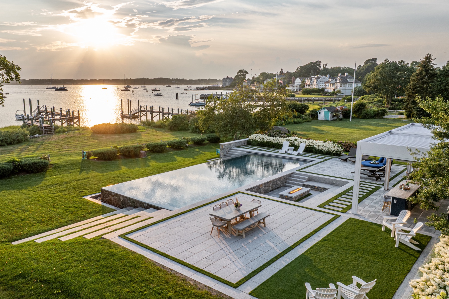
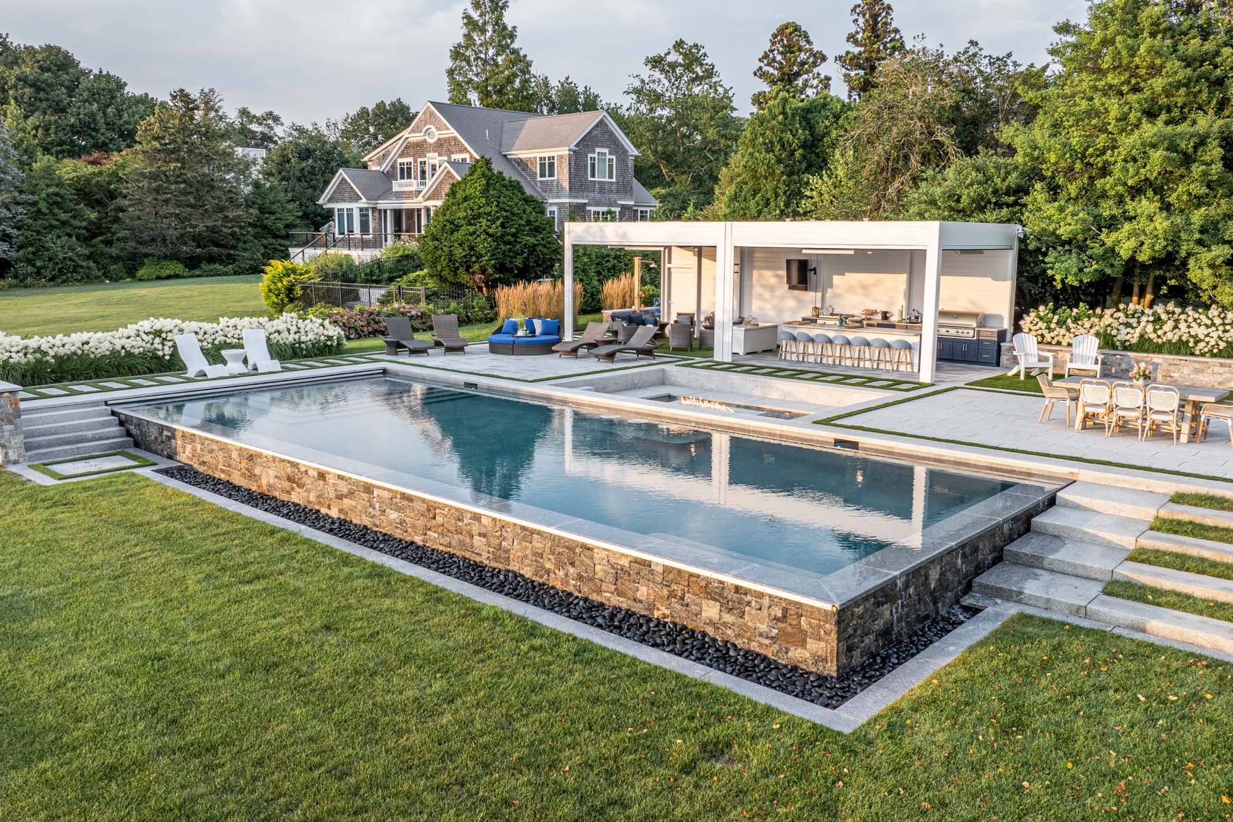
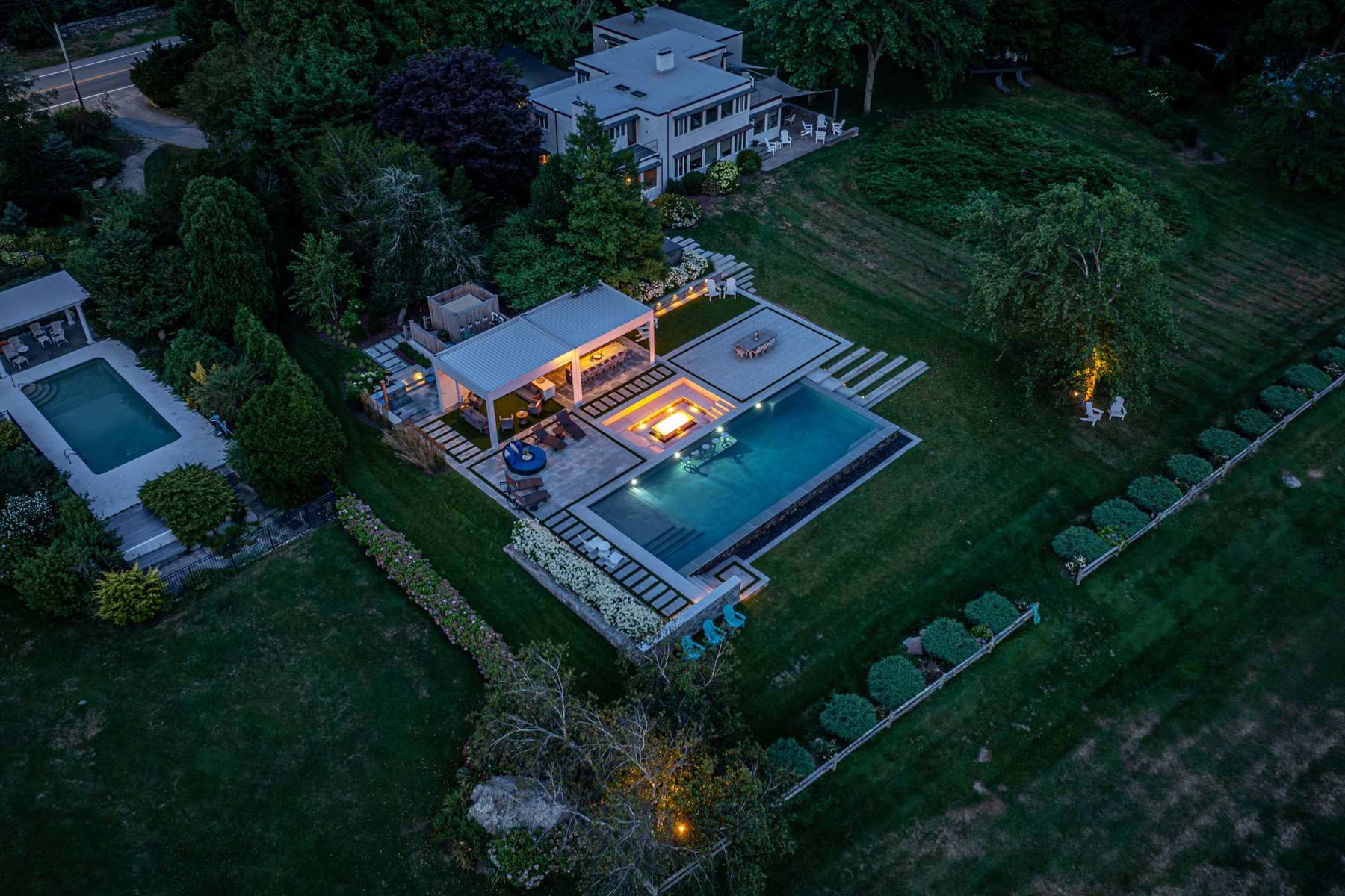
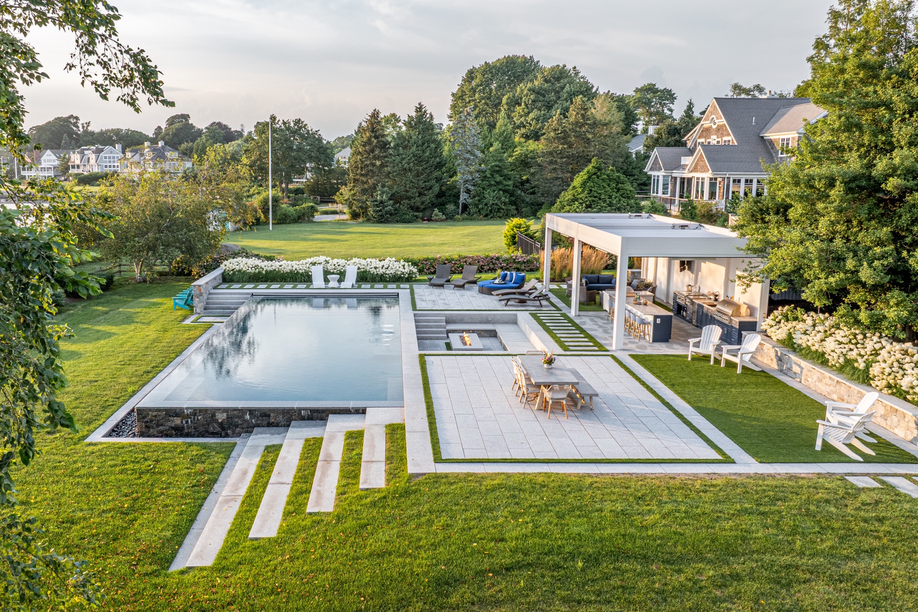
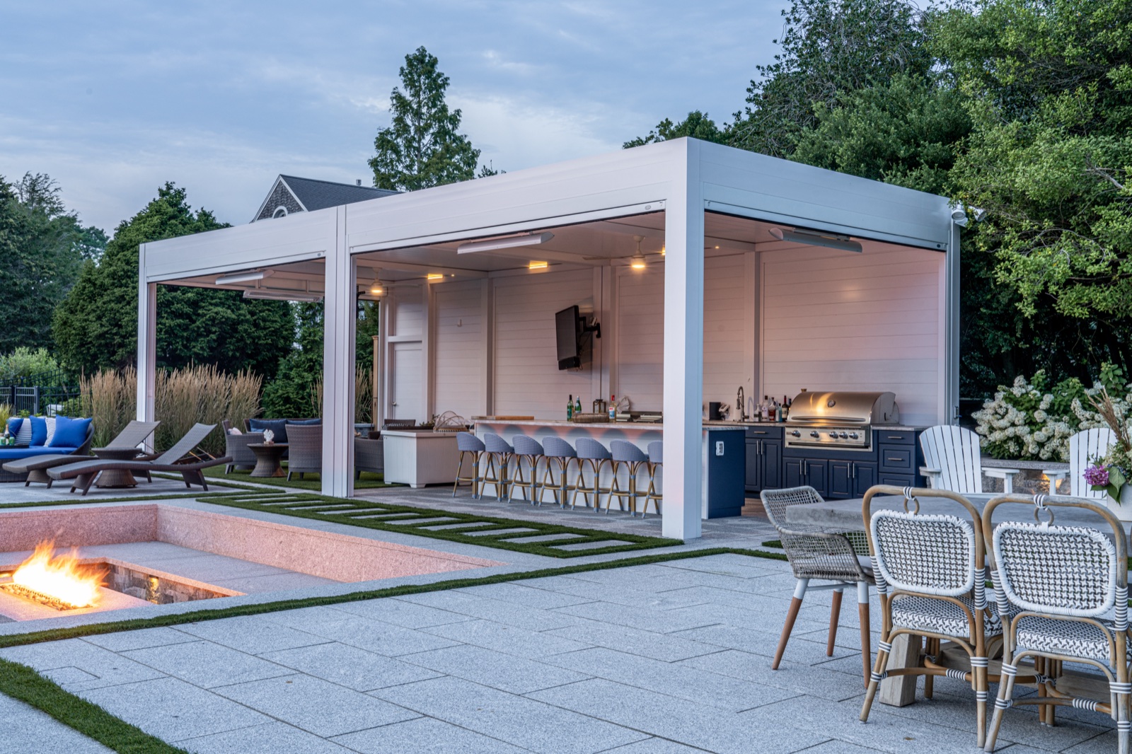
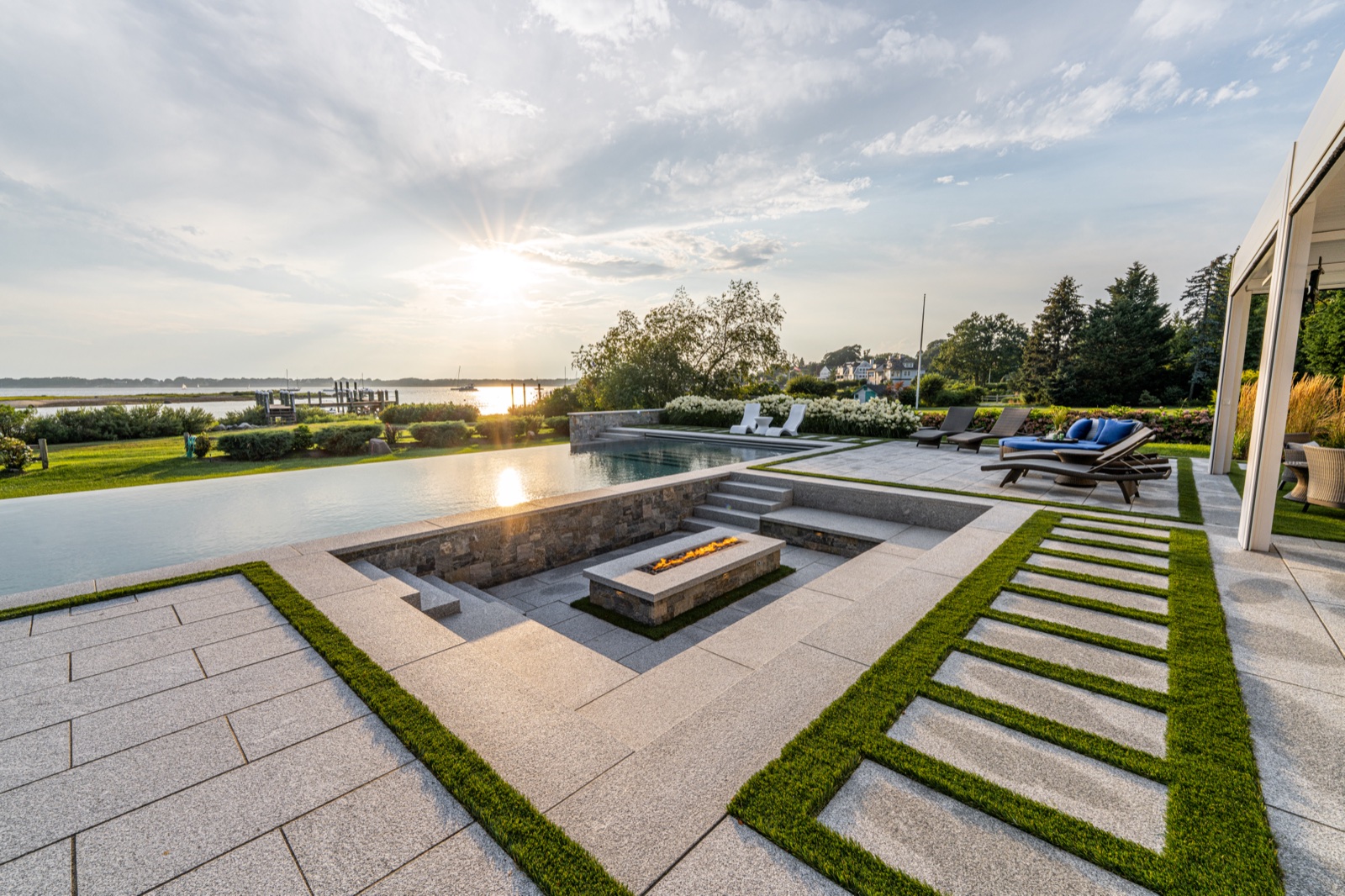
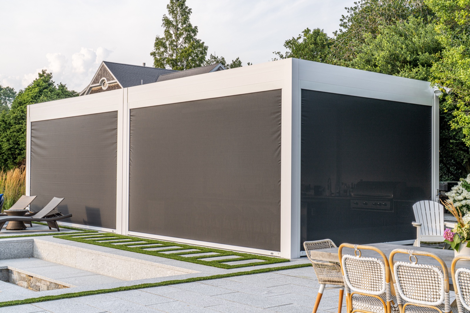
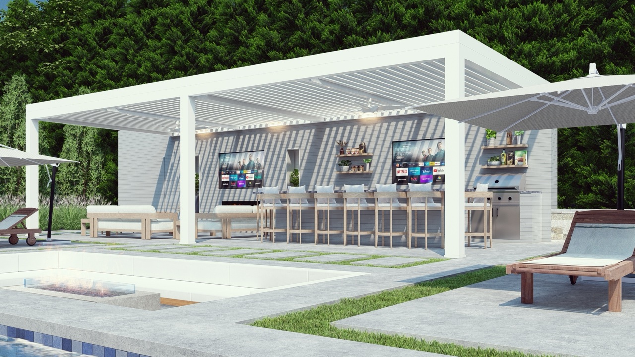
Luxury louvered pergolas, designed & installed for year-round comfort.
The #1 Azenco dealer in the tri-state area and a top-3 Platinum Azenco dealer in the nation — Breslow designs, engineers, and installs motorized louvered pergolas, retractable awnings, and motorized screen shades for residential and commercial projects across NJ, NY, CT, and beyond.